×
What's new

Tokyo Scoring Strings: Patch 1.0.7 available (fixed short notes)

because it reminds me of the movie Arrival, which was a pretty tough watch
It was a spectacularly great movie. One of the best in recent times, in fact.


Imaginary picture, for reference only, thanks
Not gonna happen, drop it.

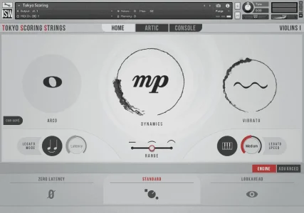
The ink evokes a sense of the elegance of Japanese calligraphy. There’s a beautiful minimalism to it. 5 stars.
At least some people over here get it. Thanks! :)
 
I mostly don't have a problem with the GUI. My usual issue is grey writing on white. I can't always see it. Or worse, grey writing on grey background. Sometimes funky colors aren't any better. If I can't read it, I won't use it.
 
I mostly don't have a problem with the GUI. My usual issue is grey writing on white. I can't always see it. Or worse, grey writing on grey background. Sometimes funky colors aren't any better. If I can't read it, I won't use it.

Any particular areas on the showcased screenshot which you find troubling to read?
 
Any particular areas on the showcased screenshot which you find troubling to read?
Mostly the grey writing is dark enough. The Latency button may be a problem. It is a little light but it is big enough I can read it. Someone with worse vision than me may have problems.

The con sord is a little hard to read, but it is just the sord part is squashed together.

Otherwise, I do like the Japanese calligraphy look. I normally think of Japanese style as clean and minimalist, so this fits.
 
Mostly the grey writing is dark enough. The Latency button may be a problem. It is a little light but it is big enough I can read it. Someone with worse vision than me may have problems.

The con sord is a little hard to read, but it is just the sord part is squashed together.

Otherwise, I do like the Japanese calligraphy look. I normally think of Japanese style as clean and minimalist, so this fits.
Thank you for the readability feedback, we will try and address these. I should mention the latency knob is “greyed out”, meaning it is an inactive knob. It’s only active in poly legato where it appears as normal (same as the speed knob on the right).
 
Thank you for the readability feedback, we will try and address these. I should mention the latency knob is “greyed out”, meaning it is an inactive knob. It’s only active in poly legato where it appears as normal (same as the speed knob on the right).
I was wondering if that was the case. Mostly it is very readable, at least for me. So I am looking forward to using it. :)
 
~snip

Tokyo Scoring Strings: Patch 1.0.7 available (fixed short notes)

~snip
This is quite nice! It's a lovely, user-friendly GUI. However, I would second that the background greys should be lightened a touch and text greys should be darkened a touch (excepting that top area with Artic and Console, where the inverse needs to happen). I also think that there should be a couple other places where red is in use - there's something visually unbalanced about it only being present at the top left and the mid-bottom right.
 
To me … A good looking GUI doesn’t make me write better music . the most important thing is that it works and sounds good , that’s really all I care TBH …
Easy access to the controls that matter most are part of the GUI decisions and are very important (readability comes close, or is perhaps tied hand-in-hand).

They seem to have done well here on providing the right controls, regardless of any opinions about the actual aesthetic choices.
 
Easy access to the controls that matter most are part of the GUI decisions and are very important (readability comes close, or is perhaps tied hand-in-hand).

They seem to have done well here on providing the right controls, regardless of any opinions about the actual aesthetic choices.
The simplicity of the front page is a response to user feedback that our products have high learning curves, and partially this is due to information and control density.

Of course, experienced power users and mockup veterans may find it wanting for more single-page density because they can understand more intricacies of sample products easily, but we have multiple audiences to cater to, including people who may be purchasing this as their first orchestral library.

At the end of the day, there is just too much offered in this product to have dense pages of parameters. We tried the parameter-dense approach in previous products like Shreddage and Ventus with our TACT v2 system for articulation mapping, and despite the power offered, many people did not know how to do basic things like change the keyswitches. Sometimes the more you display to a user, the less they understand what to do with it.
 
To me … A good looking GUI doesn’t make me write better music . the most important thing is that it works and sounds good , that’s really all I care TBH …
Same. This is usually what I see when Kontakt is even open (which isn't often outside of the initial instrument load up when straying from a template).

Tokyo Scoring Strings: Patch 1.0.7 available (fixed short notes)
 
Companies do not spend millions upon millions on UI design research because GUI's don't matter. I promise.

Anyway TSS looks fine so as long as they don't suddenly pointlessly start changing it halfway through its lifecycle I don't see a problem XD.
 
Companies do not spend millions upon millions on UI design research because GUI's don't matter. I promise.

Anyway TSS looks fine so as long as they don't suddenly pointlessly start changing it halfway through its lifecycle I don't see a problem XD.
Rest assured, the "it only needs to sound good, I don't care about anything else" is a sentiment being posted by users here, but not by us. The GUI absolutely matters to us.

We also have no reason to change it. Unless we were to move off of Kontakt, we only redesign GUI's for remakes of older, dated products, and it's usually to give them new basic features that the rest of our products have, or in the case of Super Audio Cart or Shreddage 3, we have new systems and user experiences to try and innovate with.

As far as our orchestral engine, it is as advanced as it needs to be and should be a timeless product, receiving updates and upgrades but never requiring us to redo the core of it.
 
Back
Top Bottom