Batuer
Member
Well done. Not bad, but it could be better.
This is what I feel about the GUI:
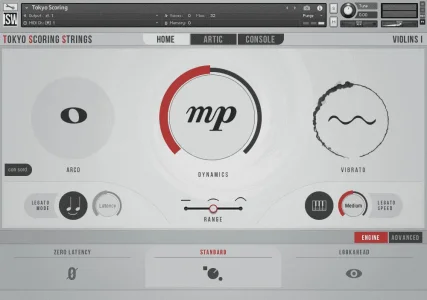
1. I like this simple design of the GUI, people can focus on music production not on parameters.
2. The color of the GUI is a bit too monotonous to attract user’s interest and inspire people’s passion for use.
3. Can the articulations be all listed directly? So people see at a glance what articulations being offered in this library.
4. Maybe the big knobs take up too much space? It seems the three knobs has no other functions besides showing the states according the GUI. Especially the vibrato knob is kind of useless when making music. Meanwhile, other libraries have big knobs but with useful functions and more beautiful
That’s my personal opinion and thanks for sharing the GUI.

Last edited:


 ...straight dipping into the sound and start working the music.

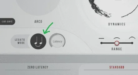



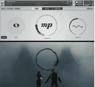

 ). I guess there are always advocates for both sides. But in the end I buy a library for the sound it provides and a good user experience while using it is always welcome. I like having something which is easy and fast to use (the endless mic scrolling in the Spitfire player isn't for example), but over that I prefer things which are FUN to use, even if that means having to "learn" it. The Jaeger GUI did that for me, but I can understand, that if someone doesn't know or like Pacific Rim, they probably don't get the same kick out of it. As long as TSS is fast & easy to use I'm good.