You are using an out of date browser. It may not display this or other websites correctly.
You should upgrade or use an alternative browser.
You should upgrade or use an alternative browser.
Some questions (and congratulations)
- Thread starter Christof
- Start date
EastWest Lurker
Senior Member
It IS getting better IMHO.Nice job in creating this new version of your web-site. Congratulations!
I don't know if it's possible but I think the ideal would be offer let's say 3 "themes" or "skins" or whatever it's called, so people can have some options, for instance 1. minimalistic light background with dark text (typical), 2. minimalistic dark background with light text (don't use pure white for text but light grey, makes a huge difference on fatigue) and 3. a more loaded one with your current high contrast design (some people liked it). Like this anyone can choose what it fits better to their taste and problem solved.
+1 making it easy for users to choose and setup is much better than to go thru endless configuration options.
Jetzer
Senior Member
A new style always takes time to get used to, I will give it some, but I have some (small?) issues though.
The old one was full screen + super clean, easy on the eye...
Hate to say it, but having these bars on the side feels like 2005 to me.
It was easy to get a quick overview of new topics, who posted + the posts looked smaller. Piet's right with his 10 vs 22 pages comment.
Also, I had to change my password to login.
It has improved though, since the first time I looked.
Last edited:
synergy543
Senior Member
Andre, the new solid blue alone makes is so much easier to read. Thanks for doing this. I could actually live with this myself however, I do like the idea of options if that is a possibility. A gradient version (Apple style) or a repeating pattern version (as in the left side bar) might be nice options. Its interesting to note that many who have stepped forward to share feedback have extensive experience in graphics and there's a strong consensus to the content of what they say (regardless of how it was said- these guys have strong opinions which in part is what also makes them great artists). Its great to see things moving in a positive direction. Two thumbs up and some extra karma points for you!
gregjazz
Senior Member
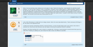
I did a little CSS cleanup to make the forum design simpler. Here's the result (see attachment). There's obviously still things to fix, like some of the alignment is off.
I mostly just removed unnecessary elements, removed borders, no more rounded edges (oops I just noticed a few more to remove), etc. Since forums are obviously very text-based, minimizing the graphical content is essential.
Anyway, more than anything this is just an idea for a possible skin. Obviously it would be best to build the skin from ground up rather than tweaking an existing one, just to keep the code as clean and efficient as possible.
Attachments
mducharme
Senior Member
It has been addressed, see the other thread in this same forum for the fix (thread started by rgames)Loving the solid blue background! Makes all the difference.
I've bookmarked the new posts page. As of now, it doesn't update when I visit and I have to click on new posts in order to get it to. Any chance this can be addressed?
Thanks
Rasmus Hartvig
Senior Member
I did a little CSS cleanup to make the forum design simpler. Here's the result (see attachment). There's obviously still things to fix, like some of the alignment is off.
Very nice Greg - love the removal of whitespace between UI elements! Also, having no (or very subtle) rounded corners does wonders.
I did something along the same lines for the avatar boxes, trying to reduce their height. Could be a suggestion for an even simpler look. Also - and this is in the extreme end of the nitpicking spectrum: Notice the subtle drop shadow under the forum menu when it is pinned to the top

I did a little CSS cleanup to make the forum design simpler. Here's the result (see attachment). There's obviously still things to fix, like some of the alignment is off.
I mostly just removed unnecessary elements, removed borders, no more rounded edges (oops I just noticed a few more to remove), etc. Since forums are obviously very text-based, minimizing the graphical content is essential.
Anyway, more than anything this is just an idea for a possible skin. Obviously it would be best to build the skin from ground up rather than tweaking an existing one, just to keep the code as clean and efficient as possible.
Good job, Greg. I just removed the red buttons on title bars.
As for building a skin from the ground up, although there is a lot of CSS, and some HTML, it's mostly PHP and Xenforo proprietary syntax. So just to reproduce the little 'avatar box" the way you have it, and for it to also be responsive, could take a couple hours, and modifying multiple files. Now imagine the rest. that's why most people will use the default skin and build from there. Which I did also.

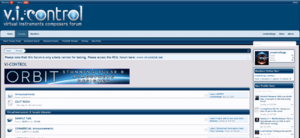
And here full-width like the old forum:
Does anyone actually use the page up/down buttons on the right side? The overlay lands on top of the posts when the browser window is less than 1000-ish pixels wide :(
Let me see about moving them out of the way...
Sorry about that...
playz123
Senior Member
I've been reading this thread on a regular basis over the last few days, but haven't commented since others have pretty much said what I would have. In any case, the most important thing for me is that everything works, and so far I've found I've been able to do everything here I wanted to do and most bugs have been fixed. It now appears the focus has shifted entirely to aesthetics and, again I like the direction in which we are headed. I simply felt uncomfortable with the original design...way too busy in my opinion, but also I was thrilled to have the forum back on line and functioning again.
I must admit I don't quite understand why someone would even suggest abandoning the forum because of the design, nor do I understand why insults were necessary. What is reassuring is the positive feedback that has been offered. And I'm sure many of us can agree that we have faith and confidence in Frederick and Andre, and I genuinely appreciate their willingness to consider changes. There is no way there will be a final design that will appeal to every single person, but hopefully we'll eventually arrive at something suitable to most. Will leave the discussions about the design of the site to others who know more about that sort of thing than I do, and just get on with enjoying the forum and appreciating what it offers. Thank you Frederick and Andre for your efforts on our behalf.
I must admit I don't quite understand why someone would even suggest abandoning the forum because of the design, nor do I understand why insults were necessary. What is reassuring is the positive feedback that has been offered. And I'm sure many of us can agree that we have faith and confidence in Frederick and Andre, and I genuinely appreciate their willingness to consider changes. There is no way there will be a final design that will appeal to every single person, but hopefully we'll eventually arrive at something suitable to most. Will leave the discussions about the design of the site to others who know more about that sort of thing than I do, and just get on with enjoying the forum and appreciating what it offers. Thank you Frederick and Andre for your efforts on our behalf.
Last edited:
gregjazz
Senior Member
Ahh, that's really nice! I like how you got it more compact. Even if you were to add back some of the user details (join date, website, etc.), I think you could still get it working in that style.
I've been reading this thread on a regular basis over the last few days, but haven't commented since others have pretty much said what I would have. In any case, the most important thing for me is that everything works, and so far I've found I've been able to do everything here I wanted to do and most bugs have been fixed. It now appears the focus has shifted entirely to aesthetics and, again I like the direction in which we are headed. I simply felt uncomfortable with the original design...way too busy in my opinion, but also I was thrilled to have the forum back on line and functioning again.
I must admit I don't quite understand why someone would even suggest abandoning the forum because of the design, nor do I understand why insults were necessary. What is reassuring is the positive feedback that has been offered. And I'm sure many of us can agree that we have faith and confidence in Frederick and Andre, and I genuinely appreciate their willingness to consider changes. There is no way there will be a final design that will appeal to every single person, but hopefully we'll eventually arrive at something suitable to most. will leave the discussions about the design of the site to others who know more about that sort of thing than I do, and just get on with enjoying the forum and appreciating what it offers. Thank you Frederick and Andre for your efforts on our behalf.
Thank you Frank... Glad we're finding our way as a community and not from behind various barricades...

The work continues, and if you have any ideas, requests, etc. please join in and speak your mind. So far there is only one post I could never read again. Not even to pick out the flesh from the bones. However, I have seen this kind of Hulk-iness before, and know is has very little to do with the topic in question, or with me. I only hope for the person that he is surrounded by enough love and support to move on and de-green, and never again have to make his way back from such nuclear extremes. It's an exhausting process, and I would know because I've been there often over the years. But we can learn new ways as change happens. I'm sure this is not who he is as a person.
He also knows by now that I tried to reach out, and that others sharing some of his views have been able to articulate them in a way that moved things along. I hope he will find the results to his liking for the most. There will be more changes coming, but we had to open the forum again for business. I personally appreciate all the feedback and ideas so far, and mostly the tones and attitudes of people sharing their thoughts.
Regards,
Andre
gregjazz
Senior Member
Ah, I really like that full width version you posted. Though IMO even the current skin's maximum width works fine, since it's plenty wide (at least on my monitor).As for building a skin from the ground up, although there is a lot of CSS, and some HTML, it's mostly PHP and Xenforo proprietary syntax. So just to reproduce the little 'avatar box" the way you have it, and for it to also be responsive, could take a couple hours, and modifying multiple files. Now imagine the rest. that's why most people will use the default skin and build from there. Which I did also.
Have you ever worked with Flexbox in CSS? All modern browsers support it (although it's still best to include the vendor prefixes). It makes alignment a breeze. Though, I'm assuming that at this point going back and rewriting lots of the styling is probably not an option, in favor of tweaks to the existing theme to improve its look and feel.
EvilDragon
KSP Wizard
I did something along the same lines for the avatar boxes, trying to reduce their height. Could be a suggestion for an even simpler look. Also - and this is in the extreme end of the nitpicking spectrum: Notice the subtle drop shadow under the forum menu when it is pinned to the top
(Broken Link Removed)
Could you post your CSS for that please?

Guy Rowland
Senior Member
FYI Andre and all, Piet has been banned so cannot reply here publicly or via PMs. Not sure if the ban is temporary.
Rasmus Hartvig
Senior Member
Could you post your CSS for that please?
Sure!
Here's the override css I'm using now:
It's a quick hack, probably fragile and may not be responsive, but it looks nice in the one browser I use - you may pick and choose

Share:
