Guy Rowland
Senior Member
Yeah it's a bit confusing. We'll talk about how to tighten the process over the next few days. Sorry about that.
No worries of course, grateful for all the improvements
")

Yeah it's a bit confusing. We'll talk about how to tighten the process over the next few days. Sorry about that.
@creativeforge --
I'd prefer if the "like" button was on the left side where it used to be. I think it's a little harder to find it now (as people tend to read left to right), and I keep going to click in the usual spot and almost accidentally hitting "report".
You might see an uptick in "reports" and a drop in "likes" with the current configuration.

Thank you!DONE!!

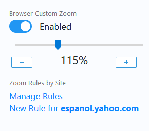
If anyone's still struggling with font size, and you happen to be on Firefox, here's an add-on that lets you set the default pt size on a per-site level:
Fixed Zoom â Get this Extension for ð¦ Firefox (en-US)
Download Fixed Zoom for Firefox. Extension that sets a custom default zoom for all pages in Firefox. You can set a general zoom for all pages or custom rules depending on the site.addons.mozilla.org
Meanwhile, I have a nit to pick, regarding the tracking of unread topic titles.
T h e y l o o k r e a l l y g a p p y .
Recovering graphic designer here, sorry. These things just get to me.
Otherwise everything looks great! Loving the dark mode.
")

DONE!!
Oh well, back to me reporting everyone... though to be fair, as I mentioned the clear difference in font between Reply and Report still makes it better than it was.
I get this as well on Android with the latest version of Chrome (75.0.3770.143). 540 x 960 screen resolution.Also, small thing, but on an iPhone I notice that scrolling down in the list of threads, I can inadvertently swipe left or right a little bit instead of just straight down or up. Doesn’t happen once in the thread itself though.
I get this as well on Android with the latest version of Chrome (75.0.3770.143). 540 x 960 screen resolution.
A phone -- Motorola Moto E gen 2.That would be a tablet?
You know they both are the same font and size? What makes it better for you?

Now I almost reported a post instead of liking it.
Here's a screenshot of the mobile scrolling issue, with the screen scrolled to the right. It looks like the What's new/Latest posts/New profile posts bar is just slightly too long and is forcing the page to be slightly larger than the screen. Only happens on pages that have that bar.

Whatever you did, the issue is fixed now.Interesting. I have a Motorola X-Play and it's not doing that. Let me look further into this.

Whatever you did, the issue is fixed now.